By Scott Hoffman
The Do’s and Dont’s of Beginning Webdesign
The Do’s
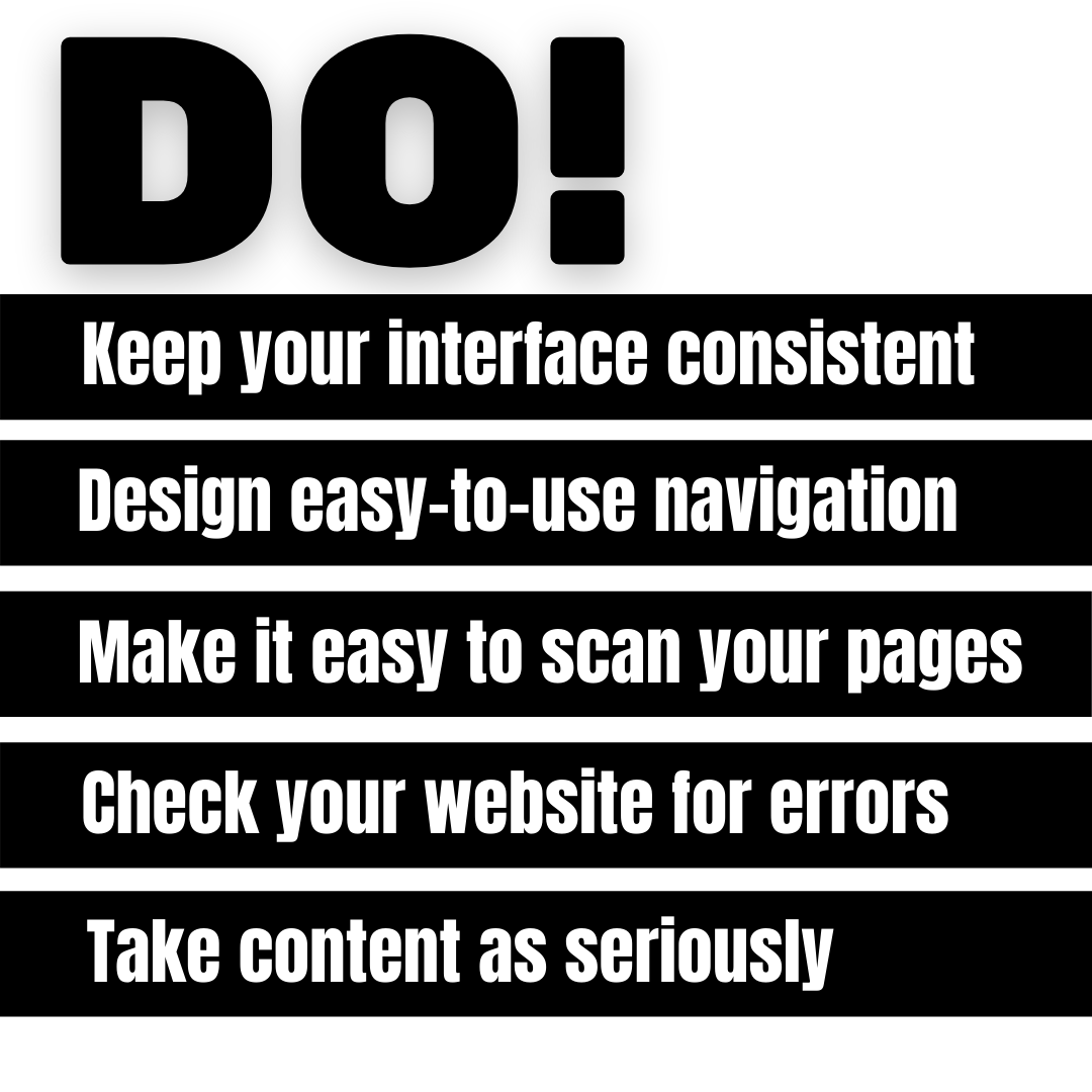
1. Keep your interface consistent
Good design starts with consistency. The overall look and feel of the entire website must flow together. It’s very concerning when an end user feels like they have moved to a completely different website. Examples of things to keep consistent are: navigation, color schemes, typefaces, and style of writing
2. Design easy-to-use navigation
This is how your end users go through your website. If this is a difficult, frustrating process, your end users will quickly leave. Good navigation means users can find what they are looking for quickly and easily.
3. Make it easy to scan your pages
Visitors are more likely to scan your page, than to thoroughly read it, especially the first time they visit. Make the important parts really stand out. Avoid “walls of text” and emphasize certain elements with different font types, sizes, and colors.
4. Check your website for errors
The best website can be undone with simple errors. Even a small error can completely tarnish a website. Some examples of small errors are dead links, typos, and incorrectly sized pictures. Take the time to ensure every small detail is checked.
5. Take content as seriously
The copy on the pages of your website is as important as the layout and design. 95% of all information on the internet is in written form. No matter how stunningly your website is designed, if you don’t have good copy, you’ve simply got a beautiful but empty box.

The Dont’s
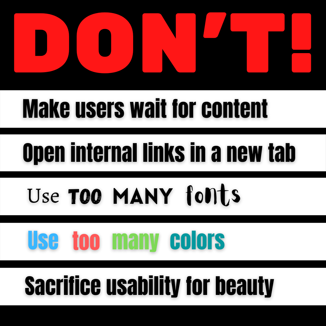
1. Don’t make users wait for content to load
Loading time is exceedingly important for user experience. If someone has to wait for more than two seconds, they will simply go to a different website. Speed needs to be a priority for any website.
2. Don’t open internal links in a new tab
Users expect different behaviors from internal versus external links. Any internal link should open within the same window, as this allows users to use the ‘back’ button to return to a previous page.
3. Don’t use too many fonts
Another matter of consistency, as well as branding. Too many fonts can be distracting, confusing, or downright annoying. It gives a website a messy, cluttered feel, instead of a clean, streamlined feel.
4. Don’t use too many colors
Similar to using too many fonts, too many colors can make a website extremely busy and difficult to understand at a glance. Using too many colors is overwhelming. Colors evoke feelings and emotions, and too many at once will confuse and distract someone. Simplicity and ease of use should always be your primary concern.
5. Don’t sacrifice usability for beauty
No matter how beautiful the design is, it should always be easy to use for the website visitor. The easier is it is interact with the website, the more positive a reaction a user will have. Avoid having busy backgrounds behind content, and avoid having insufficient color contrast between the text and the background.


How to Reach Us
We would love to hear from you!
West Linn, OR
97068
(877) 635-6049


Recent Comments